What is the KPI Comparison report?
This report allows you to compare the performance of different filter values against your configured KPIs.
How do I access this report?
This screen can be reached by hovering on ‘KPI’ in the side menu, and choosing 'Comparison' from the options that appear:
How do I use this report?
You can use the radar chart on this screen to assess the KPI performance of your filter values, for the date range that you have selected:
You can also use console filters to further refine your results.
What you see on this graph is governed by your selections in the 'Selected Key Driver' and 'Selected Data Type' dropdowns.
1. The 'Selected Key Driver' dropdown allows you to select which metric you would like to use to drive the chart:
The Key Drivers that are available to select in this dropdown are the same KPIs that are set up on the My Pins page. These are set up for you by ServiceTick when you join us, and can be added to or amended as required.
2. The 'Selected Data Type' dropdown refers to the filter values that you would like to compare on the chart, using the Key Driver that you have selected:
This dropdown presents you with each of your parent filter nodes, as well as a 'Pinned Data' option, which will use the filter nodes you currently have configured as Pins to drive the chart.
Once you have made these selections, click thebutton to load the chart.
What does this report show me?
Each shape on the chart represents a filter node (either each of your Pins or each child node of the parent you have selected).
And each axis point represents a sub-metric of your selected Key Driver (for example we have a Key Driver set up with top-box 'Ease', Knowledge, 'Valued' and 'Friendly' scores as sub-metrics):
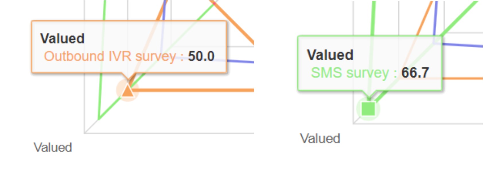
The closer a shape is to an axis point indicates a higher score for that node on the particular sub-metric. For example, the 'Valued' top-box score for our Outbound IVR Survey is 50, and 66.7 for our SMS survey.
Hovering on any data point will show you specific score information for that filter node and sub-metric:

The chart also provides you with two additional shape options: 'Average' and 'Best in Class'.
The 'Average' shape is drawn in dark blue and shows the average score for each sub-metric across all filter nodes.
The 'Best in Class' shape is drawn in light blue and shows the highest score received for each sub-metric from any one node:
All shapes can be toggled on and off by clicking on their respective value in the chart legend:
And all the data that is used to drive the report is summarised in a data table below the chart:
If you would like to export the chart, export the data table or print the page, this can be done via the 'Actions' button at the top right of the page:
Ready to put this into practice?
Comments
0 comments
Please sign in to leave a comment.