What is the Call Agent Statistics report?
This report allows you to keep track of how your organisation is performing against your specified KPIs.
How do I access this report?
This screen can be reached by hovering on ‘KPI’ in the side menu, and choosing 'Call Agent Statistics' from the options that appear:
How do I use this report?
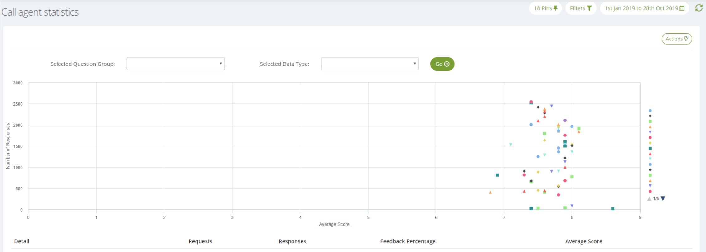
You can use the scattergraph on this screen to assess KPI performance for your configured filters:

What you see on this graph is governed by your selections in the 'Selected Question Group' and 'Selected Data Type' dropdowns, as well as the date range you have applied.
1. The 'Selected Question Group' dropdown allows you to select which KPI you would like to use to drive the chart:
Question Groups are set up for you by ServiceTick when you join us. They can be added to or amended as required, and are essentially a way of combining multiple questions so their overall scores can be scrutinised. For example, we could set up a question group containing the CSAT question from each of your different surveys, which would allow you to view overall CSAT scores for your chosen data type.
2. The 'Selected Data Type' dropdown refers to the filter values that you would like to compare on the chart, using the Question Group that you have selected:
This dropdown presents you with each of your parent filter nodes, as well as a 'Pinned Data' option, which will use the filter nodes you currently have configured as Pins to drive the chart.
Once you have made these selections, click thebutton to load the chart.
What does this report show me?
- Each plot point represents a filter node (either each of your Pins or each child node of the parent you have selected)
- The x-axis indicates the number of responses attributed to each filter node for your date range
- The y-axis indicates the scores for each filter node based on your chosen Question Group
This data will also be summarised in a data table below the chart.
What else can I do with this report?
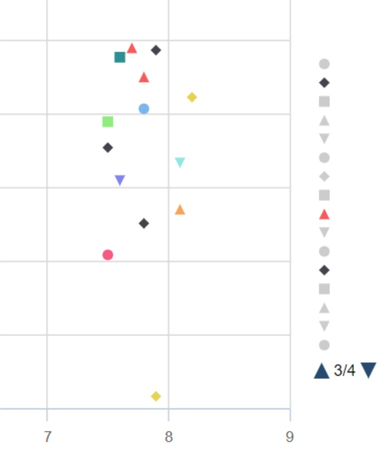
Once the chart has loaded, you can customise it to only display filter nodes of your choosing. This can be done using the chart Legend. Clicking on a value in the Legend omits that plot point from the chart, and clicking it again adds it back in. If your data values cascade onto multiple Legend pages, these can be cycled via the arrow buttons presented below the lower-most option:

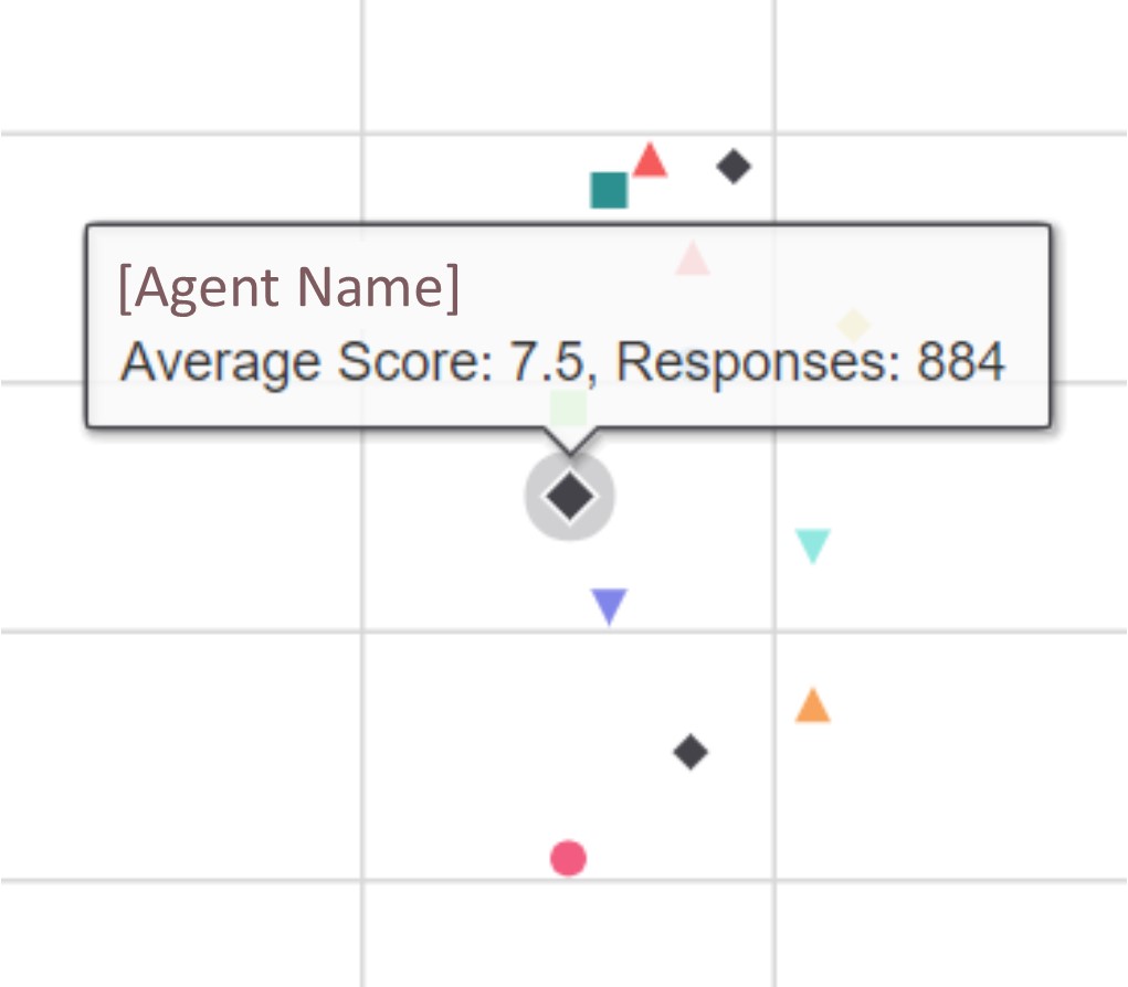
If you hover on a plot point, the chart will show you the exact response count and score for that particular node:

And if you would like to export the chart, export the data table or print the page, this can be done via the 'Actions' button at the top right of the page:
Ready to put this into practice?
Comments
0 comments
Please sign in to leave a comment.