What is the Adept distribution report?
Our Adept feature can be used to initiate survey requests and as well as make a record of when a survey was not applicable. This report shows a log of this activity.
How do I access this report?
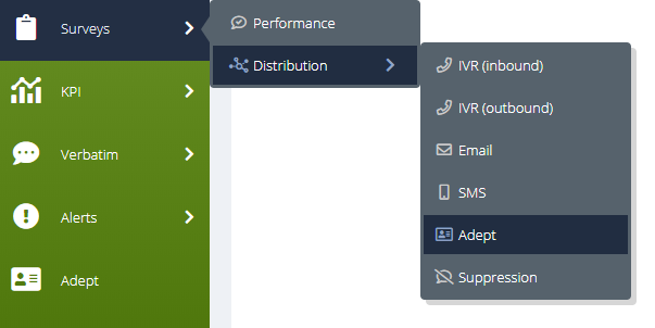
This screen can be reached by hovering on ‘Surveys’ in the side menu, which will display two sub-options. Then hover on 'Distribution', and choose 'Adept' from the options that appear:
What information does this report give me?
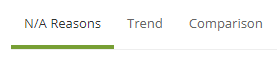
This report is split into three tabs: N/A Reasons, Trend, and Comparison. These can be found at the top of the page and switched between by clicking on the one you require:
N/A Reasons
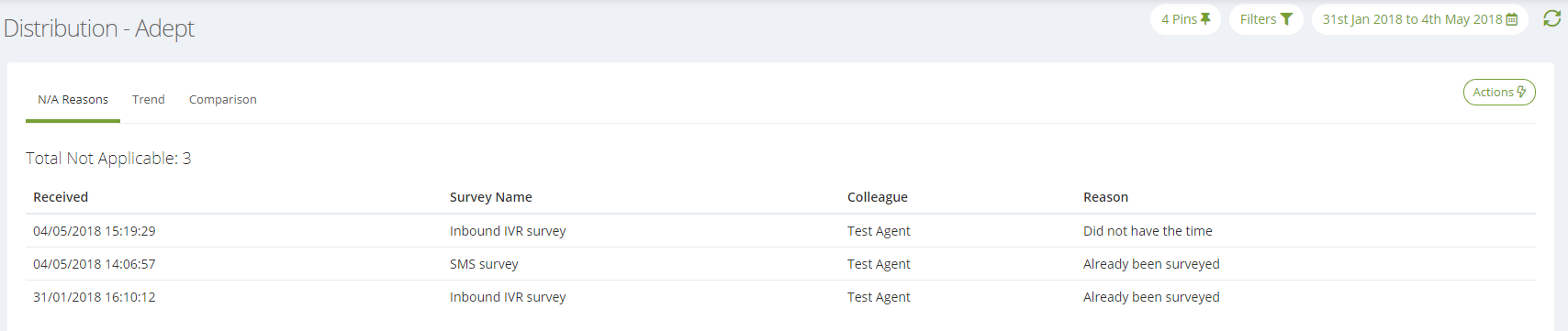
This tab displays all of the survey initiations that were flagged as 'Not applicable' via Adept, during the date range you have set:
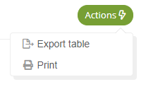
You can also export or print the page via the 'Actions' button at the top right:
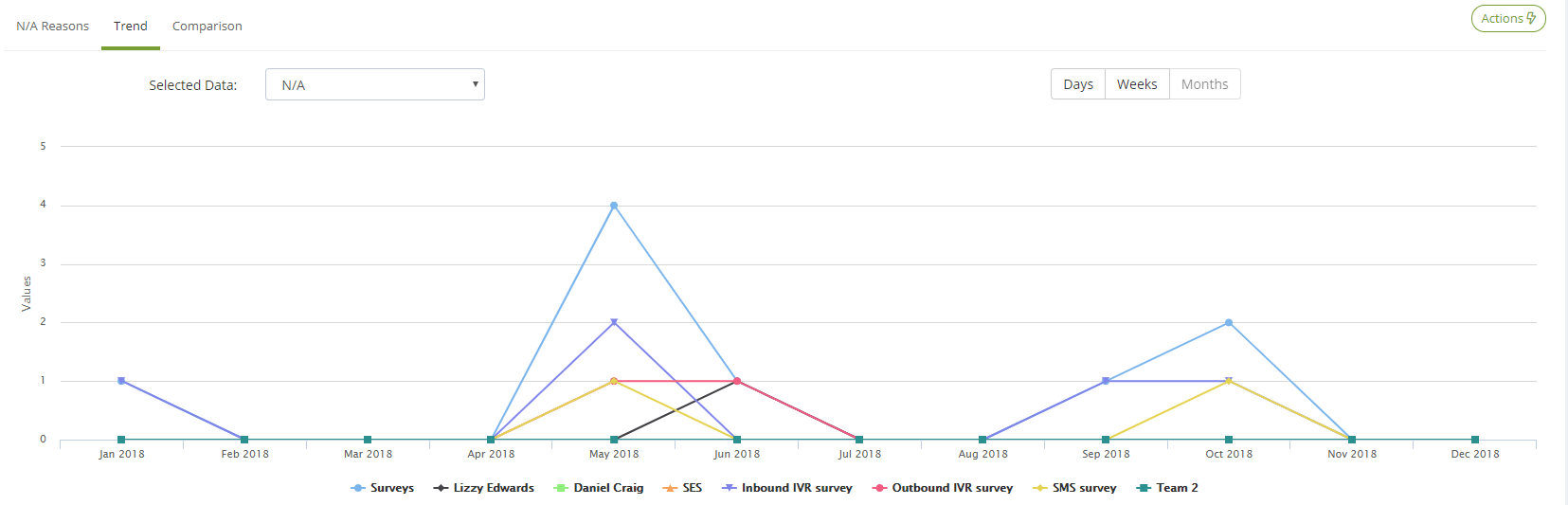
Trend
This tab shows you Adept trend data for your date range and the Pins that you have selected, in both trend chart and data table formats:
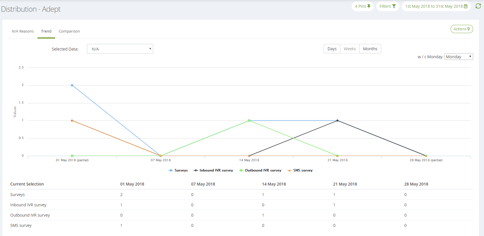
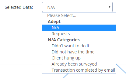
Trend data can be viewed for the quantity of total Adept requests, N/A requests, or for a specific N/A category. These can be selected using the 'Selected Data' dropdown at the top left of the graph:
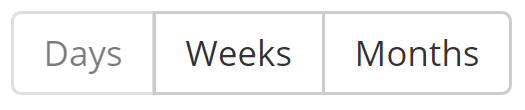
The intervals of the graph can be toggled using the Days/Weeks/Months buttons to the top right of the graph:
Changing your selection here will refresh the graph with your new selection:
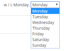
If you have selected 'Week's, an additional dropdown will appear at the far top right of the graph. This can be used to configure which day the weeks commence with:
You can also export the chart, export the data table or print the page via the 'Actions' button:

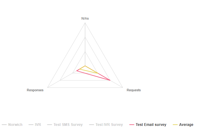
Comparison
This tab can be used to compare data for your date range and selected Pins using a Radar chart. The data is also displayed in a data table below the chart.
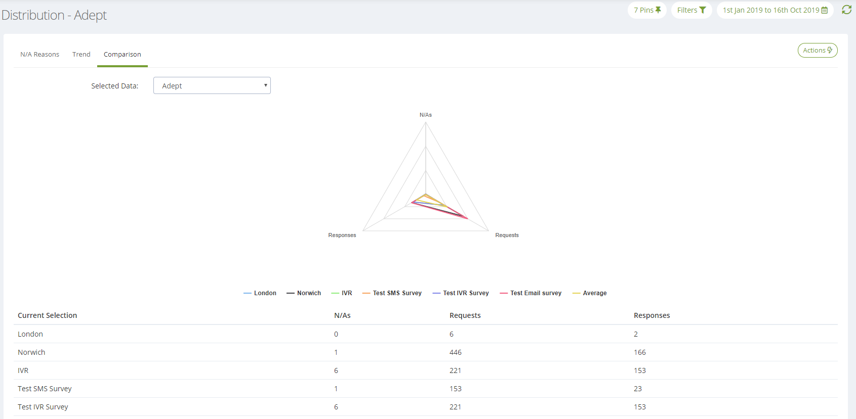
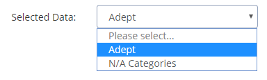
You can compare your Pins on either Adept request/response data, or quantity of N/A categories. These options can be selected using the 'Selected Data' dropdown:
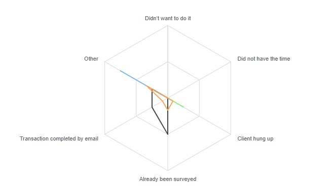
Each coloured shape refers to one of your selected Pins and each point on the graph refers to your selected data (in the case below, this is showing each of our N/A reasons).
How close a shape is to one of the chart edges is indicative of a larger quantity of data for that particular value. For example, in the graph above, the Pin illustrated by the black shape had far more people say they had 'Already been surveyed' compared to the orange shape.
If each of these Pins were surveys, this graph would prove very useful in working out how you could increase your response rates, because it will show you the top reasons why people aren't currently taking your surveys.
If you would like to only display certain Pins on the chart, you can exclude some by clicking on the corresponding value in the chart Legend. Doing so will turn it grey and remove it from the chart:
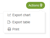
You can also export the chart, export the data table and print the page via the 'Actions' button towards the top right of the page:
Ready to put this into practice?
![]()
Comments
0 comments
Please sign in to leave a comment.