What are widgets?
Widgets define how you view and interact with data on your dashboard. Widget configuration is defined during the initial setup of your console and can be tailored to your requirements. And all data displayed in widgets dynamically adjust to any filters or date ranges applied.
We support a wide range of widget types, each of which is explained below.
Key Drivers
This widget can be configured to display your Key Performance Indicators (KPIs). Often positioned at the top of dashboards, they serve as a great way to check and track your most important scores at a glance.
The displayed number can be a ‘raw’ score (e.g. an average score for a given survey question), a calculated score (e.g. an NPS score) or a percentage (e.g. the percentage of people that scored either four or five for a particular question):

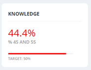
There is the option to specify a target if required (which is displayed as a progress bar):
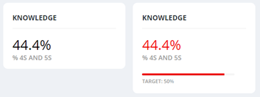
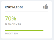
The colours used to indicate before and after a target is reached are customisable. And the indication that a target has been reached is also illustrated with a thumbs-up icon:
Feedback
This widget allows you to view your survey responses without having to leave the dashboard. A summary of each response is displayed upfront (and what information is shown here is customisable):
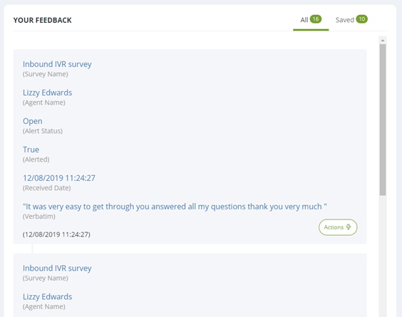
Clicking the ‘Actions’ button followed by ‘View details’ will open a window containing all details relating to that survey response:
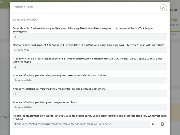
And clicking ‘Save’ in this Actions menu will add the response to your ‘Saved’ tab, making it easier to find later:

Bar Charts
This widget shows data as a bar chart. Each chart supports up to four bars and offers both regular and stacked variants:
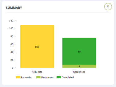
Some examples of data these charts could plot include survey request or response counts, top-box scores as well as other calculated question scores.
The chart can be downloaded as an image or data file in a variety of formats, and this can be done via the Actions button at the top right of the widget.
Pie Charts
The pie chart widget can be set up to display individually configured segments, or it can be used to display a distribution of answers for a particular survey question; for example, the number of people who scored each answer option on a ‘customer ease’ question:
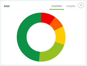
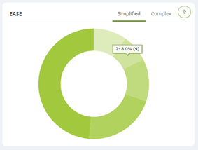
All pie charts have two view options. Whilst in ‘Simplified’ mode (as seen above), hovering over any segment provides detailed count and percentage information. Or if you prefer, there is a ‘Complex’ mode, which provides percentage information for all segments at a glance:
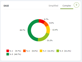
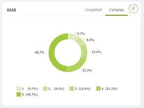
And these view modes can be toggled by using the ‘Simplified’ and ‘Complex’ tabs towards the top right of the widget:

The centre of any pie chart is also configurable and can contain a KPI or count of your choosing:
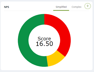
The chart can be downloaded as an image or data file in a variety of formats, and this can be done via the Actions button at the top right of the widget.
Trend Charts
Trend charts are a great way to visualise data over time. These charts can be used to plot the same data as the other chart types, so can be used to complement the static scores which bar and pie charts provide:
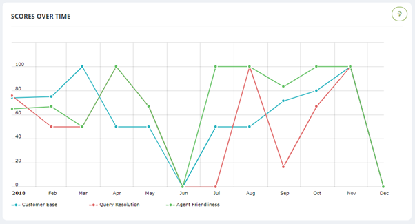
The chart can be downloaded as an image or data file in a variety of formats, and this can be done via the Actions button at the top right of the widget.
Word Clouds
This widget is a great way to visualise the answers received to your verbatim survey questions. The word cloud displays the most mentioned word in the largest text, gradually getting smaller as words become less frequently used:
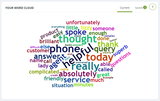
This widget can either display all answers, or only those given to a specific subset of questions of your choosing.
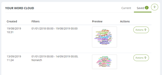
Any word cloud can be downloaded as an image to use locally or saved in the separate tab within the widget to view later:
Comparison Charts
Comparison Charts allow you to see an overview of the data that is most important to you all in one place.
The table columns can be configured to contain any data type - whether it be survey volumes, question scores, averages or any custom data. And the handy dropdown in the top left allows easy switching between your filters. This enables you to view KPIs at any level of granularity you require (e.g. team member, team or overall for that survey):

There is also the option to auto-highlight the highest and lowest values within each column, in colours of your choosing.
The Comparison Charts can be downloaded in .csv format via the 'Actions' button found at the top right of the widget (please note these exports can take up to 15 minutes depending on the quantity of data you are downloading).
Badges
If you are utilising our badges functionality, this widget displays each user’s most recently unlocked badges and the badge they are closest to earning next:

Leaderboards
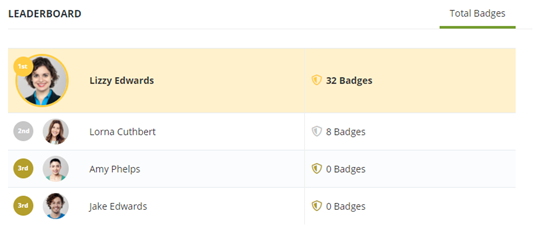
This widget is also for when badges are enabled. The leaderboard widget ranks all members of staff who have unlocked badges in order from most to least, serving as a great motivator to reach pole position!
1:1 Actions
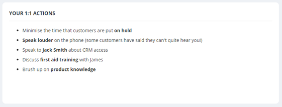
This widget is designed to be used in conjunction with our 1:1 (My Coach and My Team) functionality. If in use, this widget pulls through the actions outlined by the team member’s line manager after their 1:1 meeting, keeping them in plain view and serving as a helpful reminder:
Text
Text widgets can be used to display pertinent information/news, or to broadcast announcements on the dashboard for everyone to see:

External Sources
We can also configure widgets that pull through information from external sources such as RSS feeds, allowing you to broaden the wealth of information your dashboard can provide.
Ready to put this into practice?
Comments
0 comments
Please sign in to leave a comment.